WEEK 2 / THE SITE BUILD
So you’ve decided you need a personal website—but now you’re probably thinking, "Where do I start?"
Building a site can feel extremely overwhelming with all of the details that go into it. That’s why we decided to have a Career Contessa team member (aka me!) go through the entire process, keeping track of all the little details that go into creating your site.
This guide will help you put together your entire personal brand and online presence, using my real life as an example. Because let’s be real, it’s much more than just throwing some words on a page.
One note: Building a portfolio site isn't for everyone. If you're working in a corporate environment, you may not need something this complex. And if you simply don't have the time right now to dedicate to a full portfolio build out? That's OK. You're the perfect candidate for
creating a cover page.
Step 1: Write Your Personal Pitch [2 hours]
Is your LinkedIn summary up-to-date? Does it offer a good explanation of who you are? Sweet. Then you are one step ahead because all that information will probably work just fine for your site as well.
If you haven’t updated your LinkedIn recently, you should start by completing our Personal Pitch worksheet (below). This will help you write out exactly who you are, what you do, and why you’re the best at what you do. Me? My LinkedIn summary hadn’t been updated for about a year. Yup, and I work for a freaking career advice website. (Makes you feel better about yourself, right? Thought so.)
Use Your Personal Pitch to Write Every Bio You'll Need
Once I filled out the worksheet, I was able to whittle down what I wrote to work for my
LinkedIn bio, website
landing page, and website
about page. It helps, promise—just the act of writing about yourself will get you warmed up for the sometimes awkward task of bragging online.
Pro Tip: Your personal pitch is meant to be fluid. I used it to come up with the short tagline for my site (e.g. "Marketing Strategist for Growing Brands"), and I expanded it for my About page. Depending on context, you should be able to adapt it to fit in most formats. Think of it more like a tone-setting framework than an end-all-be-all.
 Pin me for later.
2. GATHER YOUR ASSETS [2-4 hours]
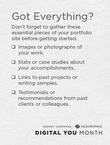
Now it’s time to gather everything you need to put your actual site together. To save you some of the time I wasted figuring this out we made the checklist at right.
For me, it made the most sense to think in terms of some big projects I’ve worked on at my current and previous gigs, as well as a few of the big client projects I worked on at my ad agency. 5-6 examples of your best work is great. You’ll also want to be sure to show a nice range of the different types of work you’ve done.
3. SIGN UP FOR A SQUARESPACE TRIAL & CHOOSE A TEMPLATE [1 hour]
It’s go time!
Start by browsing
the template options on Squarespace. As I went down the rabbit hole of aesthetically-pleasing site demos, I tried to keep my brand (aka my look and feel) in mind.
Defining Your Look and Feel
Look and feel is marketing-speak for the overall vibe you want to create on your site—think: the colors, fonts, images, etc. For me, it helped to create a list of adjectives that I feel describe me as a person and professional: scrappy, energetic, creative, ambitious, detailed (do some of these look familiar from my personal pitch notes?).
I should point out that visuals are very important to me. If they’re not your thing, the upside of Squarespace is that every template is built with aesthetics in mind. Really the only thing that you would definitely want to change is the photos—the colors and fonts are good to go.
Next, Consider Your Content Needs
I knew I needed a template that would allow me to highlight photos and descriptions of past projects. As a marketer, I needed to make it clear what my role was on each of the projects I chose to highlight—and clearly call out the results.
As part of my career strategy, I’d decided I wanted to start writing more about my industry. I wanted people who visited my site to think “Hm, this girl is on it.” I gave myself a goal of writing one post per month about different marketing strategies I’ve learned or tested. Not only do I think keeping a blog on my site will help showcase my capabilities, I also think it will be fun to read in the future when I know much more (and will probably look back and think, “Ha, talk about amateur hour antics”—but I digress).
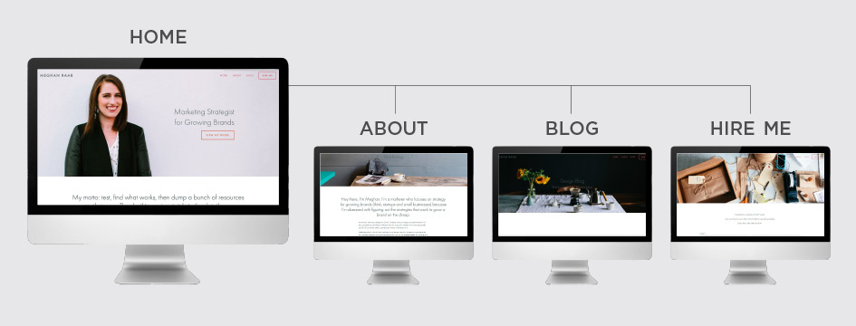
In addition to thinking about my goals, I stopped to think about a sitemap. I knew I needed the following pages:
- A homepage that explained what I do, and provided a more visual version of my resume
- An About page that included my personal pitch
- A Hire Me page to let people know I was available for small consulting projects
- A blog so I could write posts about marketing strategies regularly
And Now, Pick Your Poison (Err—Template)
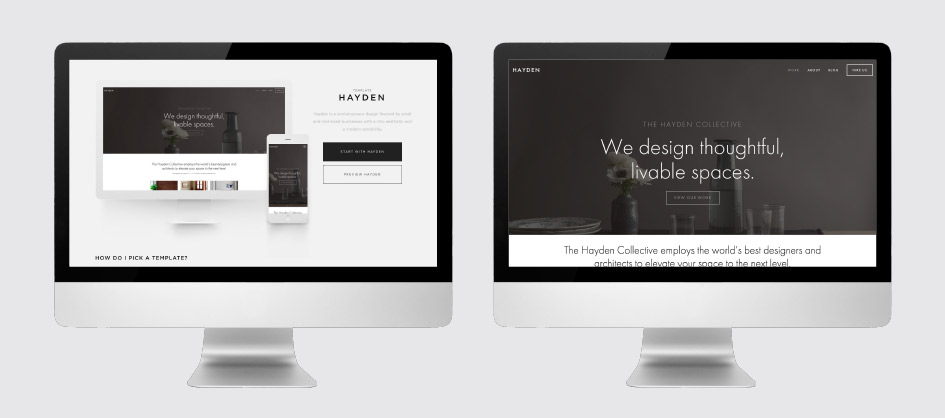
Ultimately, I chose “Hayden” because it offered exactly the homepage I had in mind and a clean blog template. After defining your look and feel and made a list of template requirements, if you're still not sure what template's right for you—we made a
quiz for that. It will point you in the right direction.
4. GET BUILDING [8-40 hours]
I’ll start by acknowledging that Squarespace can be a bit of a beast. It offers so many features (read: even e-commerce) that it might feel overwhelming at first. I had those moments. Depending on how much of a control freak/perfectionist you are (I know I am), this part of the process will take the longest. Plan on setting aside a couple of Saturdays to get it done.
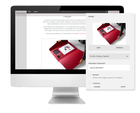
It will take you a few hours to get the hang of the system (it took me a bit to realize that you go to the Pages tab to edit text and the Design tab to tweak the visual style of those pages), but once you learn the way your template works, you’re up and running.
And here’s the thing, you’re not alone. Squarespace is a customer-centric company. Once you sign up for your trial, you’ll get a series of emails in your inbox to guide you through getting started. And there are
video tutorials on every step of the process. Plus, the designs are all-inclusive so you don’t have to worry about the icky stuff—like buying hosting and linking it to a domain name you bought somewhere else or whatever.
But best of all? There’s a
live chat feature for any question you might have and anytime you might get stuck. 24/7 help. Use it. Seriously.
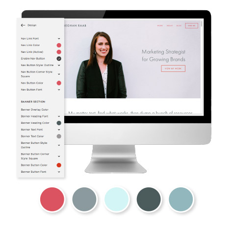
Choosing Colors
You can go with the default colors Squarespace offers, but it doesn't hurt to set yourself apart by playing around with the color scheme. To get some color inspo, I thought about brands I love, like
Studio DIY and
Packed Party, and checked out their Instagram feeds. I noticed they have lots of bright colors with black and white peppered in now and then. I kept this in mind when choosing my color scheme, using
Coolors to help generate a palette of monochromatic grey-blues with a darker terracotta as my accent color. The pop of color is a nod to my affinity for those bright, fun Instagram feeds, but the neutral tones help keep it professional.
Getting Some Visuals
So headshots?
Highly recommended. If you can find a friend who takes photos professionally or as a hobby, you’re golden. If not, you can pay a pro or make your site pop with stock photos (more on that in a sec). For my own headshot, I knew I wanted a professional photo taken of me against a solid background for the header of my site, so that my one-liner would be easy to read layered over the photo.
Pro Tip: I waited to take my headshot until I started building my site, so I could make sure I got the right kind of image.
Next, I went to
Unsplash and looked for some stock photos that I liked to continue creating the overall vibe I was going for. Squarespace also has a
partnership with Getty Images that you can use while building out your site. In any case, I literally typed in things like “gray” “scrappy” “energy” “details”—things that aligned with the brand adjectives and colors I had already chosen. I ended up using a greyish-white linen texture to create a more dimensional look on the banners that highlight my past projects.
5. Go Live [Kind of Instantaneous]
When I was satisfied with my site (more or less), the final step was to make it site live so people could actually find me. That part was super easy on Squarespace. Once I did that, it was time to update my social media accounts and email signature to include my URL.
Pro tip: Linking your URL to your social media can actually improve your SEO—in lay woman's terms: if people search for your name, you'll come up higher in those results.
The great thing about a website is that you never have to feel like you're "done." You can always make edits, add new projects,
change your Squarespace template even. There are some things I'd like to tweak in the coming weeks, but once I was feeling good about the look and feel, I decided to take the plunge. I honestly felt like I'd earned a celebration—maybe a glass of prosecco at our next team happy hour. I'm now officially "digitally present"—check it out:
 View the live site here.
So What's Next?
1. Register for a Squarespace Trial + Pick Your Template
Get started with your free 14-day trial to get started ASAP. You'll need to pick a template and there are a ton of options, which admittedly, can feel a bit daunting. Good thing
we made a quiz to help you determine the best choice(s) for your needs. It's like an interactive cheatsheet.
2. Make Use of Your Squarespace x Career Contessa Discount
Once you're ready to go live with your site, don't forget to use our discount code CONTESSA to get 10% off your Squarespace account.
3. Come Hang Next Thursday
We'll also be back next Thursday with a series of interviews with real Squarespace users in a variety of fields. Because, you know, we love hearing how other women take charge of their work.
 Pin me for later.

 View the live site here.


