Photo by Karolina Grabowska from Pexels
We don’t need to tell you how imperative it is that you have a strong resume when job searching.
You know that if you want to stand out from the crowd, you’re going to need a pretty perfect resume. But figuring out how to create
this perfect resume is
such a challenge.
That's why we want to go over some
tried and true resume tips, and break down why formatting a resume is so hard. That way, you can learn how to make the resume process easier, speedier, and more effective.
How Your Resume Can Land You the Job
When you submit your resume online, it can feel like you’re sending it off into the great unknown. Is anyone even reading it? They are. But they are also reading dozens and dozens (possibly hundreds) of other resumes.
Don’t despair—there’s a surefire way to
stand out from the crowd. It'll take a little extra work, but it will also make all the difference in your job search.
You need to align your experience with every future job and company you apply for. Creating one resume, no matter
how well it shows off your skills, is not enough to make it clear that you're the best candidate for the role.
You should have one master resume template with all of your past roles, education, and accomplishments listed. But for every job you apply for, your resume should be tailored for that specific role.
By tailoring your resume for the unique job and company, the recruiter will feel like you’re talking directly to them—and that you’re the perfect candidate—without distracting them with irrelevant information.
This isn't as bad as it sounds. It just means gathering all the important information you need and picking the ideal layout to show it off. Guess what? We made a quiz for that:
We'll deep dive into resume template styles in a minute, but first, here’s a detailed breakdown of how you should tailor your resume for each role you’re applying for:
Step 1: Define the Target Audience
Before you write anything, you need to know who you want to reach. This is because once you know who will read your resume and what’s important to them; you can shape your message accordingly. Start by thinking about the type of job and company you’re applying to.
Ask yourself questions like:
- Is this job a specialist or generalist role?
- Is this job part of a department within a large and established corporation?
- Is this a small start-up where I would be a one-woman team?
- What background do many of the current employees have?
- What problem is this job and company solving?
- Which parts of my background would be most interesting to the hiring team?
Step 2: Define Your Unique Value Proposition
You offer a unique combination of skills, experiences, and characteristics that make you different than every other candidate. To stand out, define what this unique combination is—we’ll call this your value proposition.
Start defining your value proposition by thinking about what separates you from colleagues, friends, and potential candidates. Whatever it is, you can use it to set your resume apart and tell the unique story of you. And again, make sure to tailor your value proposition to the jobs and companies you are applying for.
Step 3: Study the Job
When reading the job description, pay careful attention to the following:
- What skills are they looking for?
- What are the day-to-day responsibilities?
- What are the job requirements?
Next, match your experience to the job requirements.
Step 4: Define Your Key Accomplishments
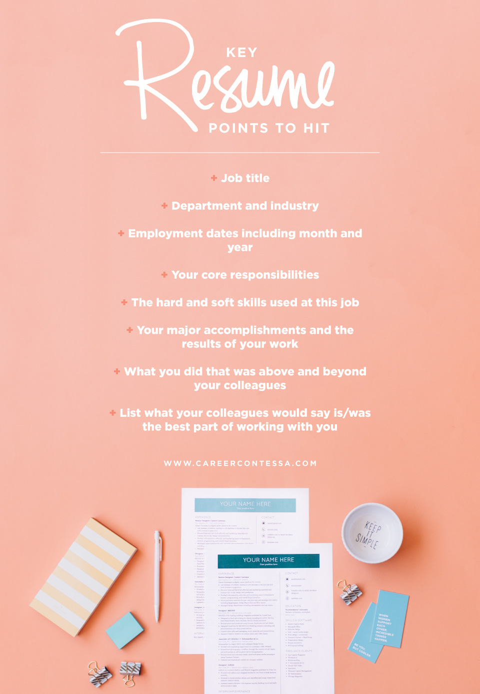
To really stand out on a resume, you need to list out your accomplishments and not your job responsibilities. You can explain your day-to-day duties in your interview, but your resume needs to highlight that you get stuff done.
In other words, you don’t just show up to work, you show up and produce results. Consider the following:
- What problems have you solved?
- When and how do you go above and beyond at work?
- Have you broken any records?
- Have you built or implemented a tool that saves money or time?
- Have you simplified a process?
- What do you do at work that your colleagues don’t?
Why Is Formatting A Resume So Difficult?
Now that you know what you want to include in your resume, it’s time to format it in a way that is easy to digest and shows off your strengths. This is where things get tricky. Formatting a resume can prove to be difficult for a few reasons.
1. You Need to Edit, Edit, Edit
It’s surprisingly easy to fill up the first, and what should be the only, page of your resume. You’re very accomplished! And we know it can be really tempting to squeeze as much information onto your resume as possible. But you really should stick to one page if you can help it.
2. It Needs to Look Good and Read Well
Creating a resume that’s easy to read and looks good, while highlighting what’s important about your professional history is no easy feat.
Since you have a limited amount of space, you’ll want to include all the important details without making your resume too cluttered and dense. In other words, your goal is to make it easy for the recruiter to read.
3. You Have ~6 Seconds
Lastly, you have to design a resume that will capture a recruiter’s attention in under six-second and be easily read by an online job application system.
Yep, you have to cater to humans and machines in one resume. And if you’re not a designer or have a solid foundation of design skills, you’ll be stuck with whatever template you can find online.
If you’ve experienced any of these things, you’re not alone! Formatting a resume is probably the biggest barrier that keeps people from applying and landing jobs.
How Your Resume is Reviewed
A well-designed resume is more likely to cause a recruiter or hiring manager to pause on it—and read closely. A clean, simple, and consistent design works best for recruiters’ eyes and online application systems.
So how do you balance the need to design a resume that is easily read by machines and real people? Here are a few basic design rules you should always stick to:
Font
You will want to use
resume fonts that are common, because not every computer carries the same fonts. Try Helvetica, Arial, Century Gothic, Verdana, or Cambria. Both Macs and PCs use these fonts. Your font should be in a readable size between 10-12 pt.
Length
You know the rule—but as a friendly reminder—try to avoid having a resume longer than one page.
Margins
Keep your margins between 1 inch and .08 inches. You need to have some white space on your resume.
Use a Template
Unless you’re a graphic designer by trade, you’ll probably struggle with designing your resume. Why does nothing ever line up the way you want it to?
Our favorite job searching hack is to use a
pre-designed resume template. By downloading one of these templates, you can ensure that your resume will have a clean, professional design.
How to Format Your Resume
Formatting a resume is a lot more than just deciding if you should add columns or what type of font to use. An easy way to keep a clean layout and ensure you relay your story to a recruiter properly is by picking the right “format”.
There are three common ones you should consider using—chronological, functional, and combination. Let's break down the differences.
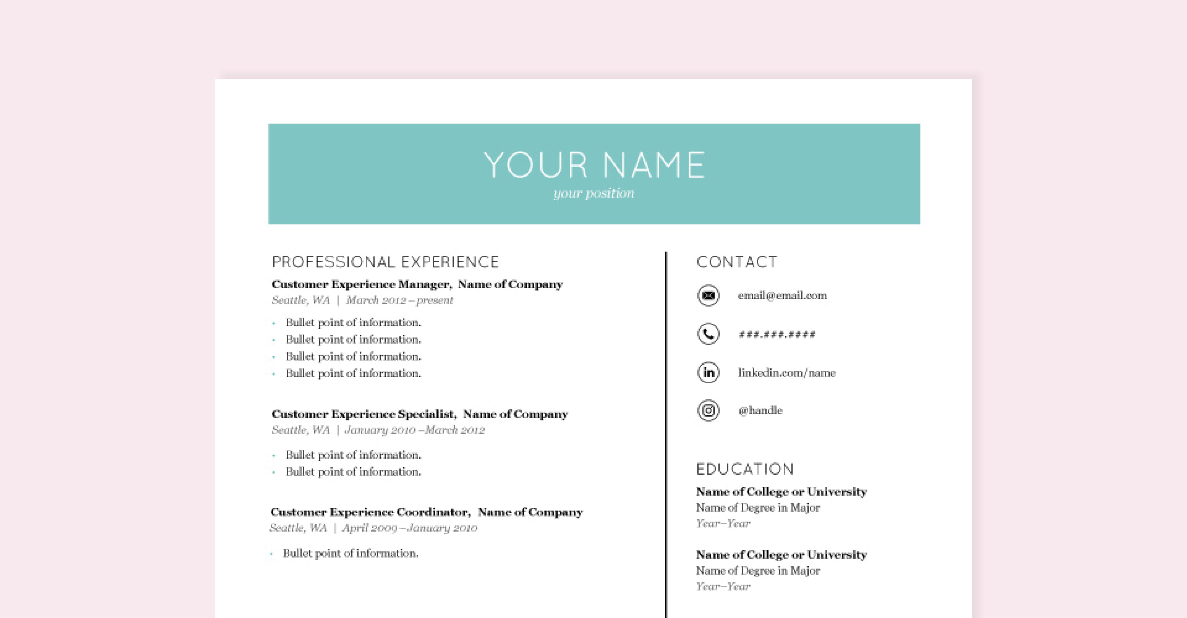
Chronological Resume
This type focuses on your most recent work experiences. Your jobs are listed in reverse chronological order with your current, or most recent job, first.
Your education and related skills are also included in this resume, but the location depends on what you want to highlight, and what would be most enticing to the recruiter. If you want your technical skills noticed first, list them at the top. Maybe you graduated from a well-known business school and the job description listed “MBA preferred”—you would want to list your education at the top.
Example: Here’s how someone who currently works in customer experience management and wants to continue to work in customer experience would highlight their experience.
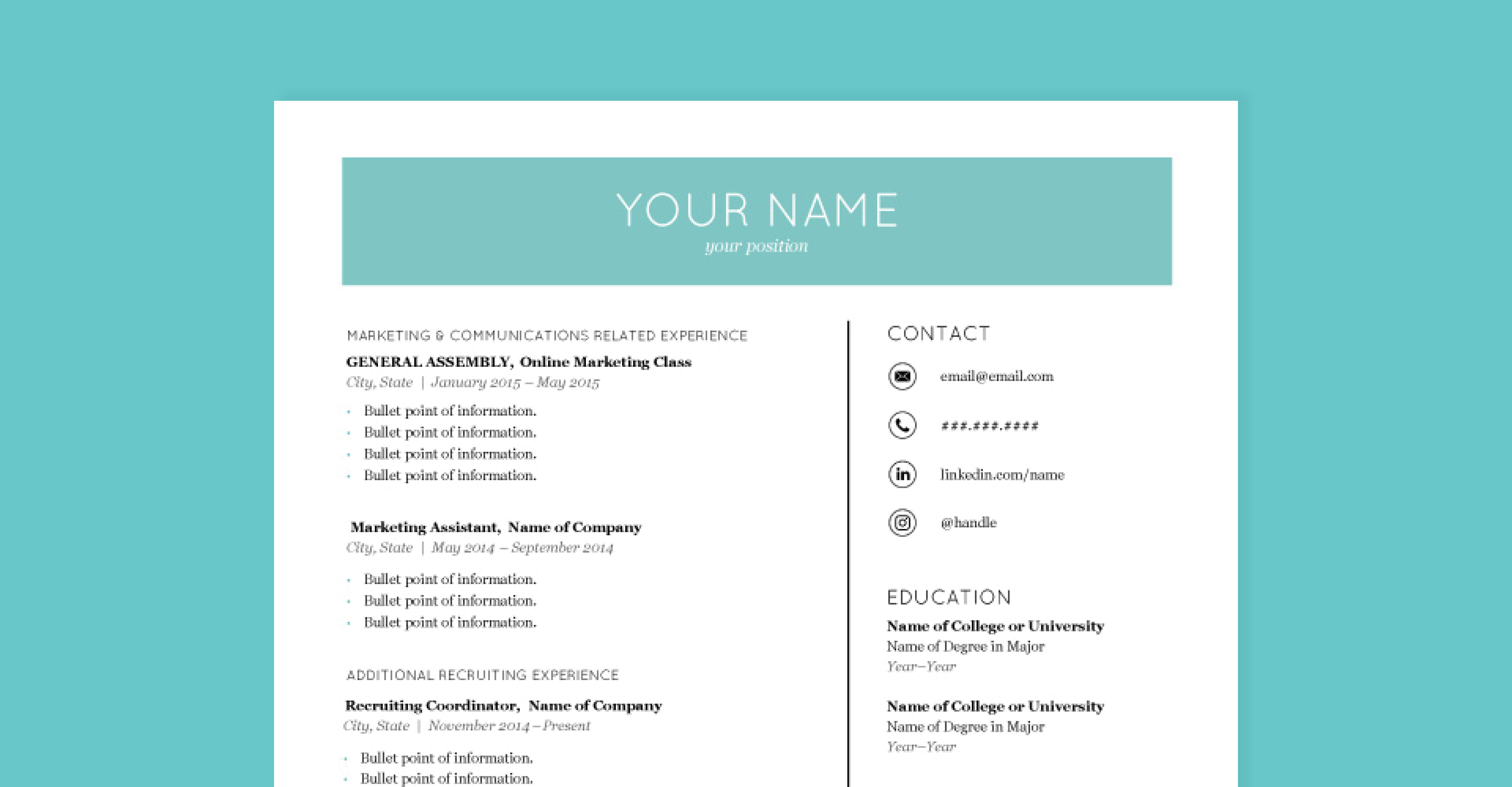
Functional Resume
A functional resume focuses on your skills and experience, rather than on your chronological work history. In this format, specific skills and capabilities are emphasized to highlight the potential employee’s competency.
Example: Here’s how someone who currently works in recruiting, but wants to switch to a marketing role, would highlight their specific marketing experience.
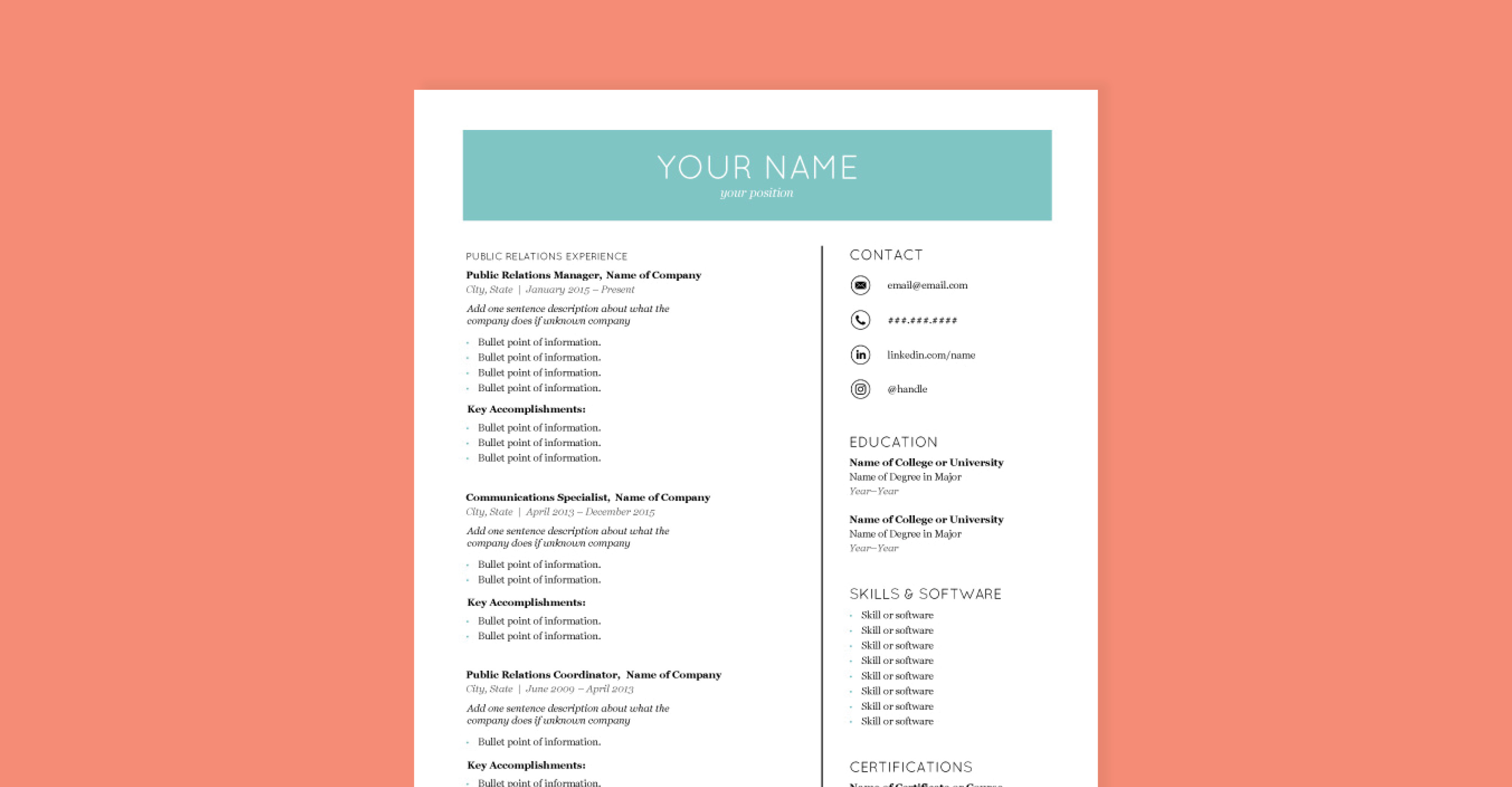
Combination Resume
This is exactly what it sounds like—a combination of a chronological and a functional resume. At a certain point in someone’s career, they have numerous core competencies and accomplishments.
A combination resume allows you to show your multiple years of experience through a chronological list while also spotlighting your accomplishments.
Example: Here’s a mid-level professional who has 5+ years of PR work experience at two companies and wants to continue to work in PR.
Need help figuring out which resume format is right for you? Take our free quiz that will point you in the right direction.
The Finishing Touch
Want one last piece of advice for making sure your resume formatting is perfect? Print two copies out. One for yourself to review, and another for a trusted friend or colleague.
Reviewing a hard copy of your resume can give you a different perspective than when viewing it on a screen. And—whoever reviews the second copy can very easily jot down any notes about typos or formatting errors.
Once you’ve done a thorough review you’ll be off to the races! Good luck with your job search!


