There are many "rules" to follow when writing a resume, but you can break rules when designing yours.
As a recruiter sorts through dozens and dozens of applicants, resumes start to blend together. Make yours stand out from the rest by introducing some unexpected professional flair.
But when it comes to
crafting your resume from a visual perspective, how can you be sure which approach will get you in the door—and which could keep you from getting noticed? Here are a few common pieces of resume design advice that you
shouldn’t heed. After all, we can all agree that certain professional rules are made to be broken!
1. Only "Creative" Resumes Stand Out
If you’ve been working in the professional world for a while, you have probably heard a few career resources say that
designing an attractive resume is only for people in “creative” lines of work.
While it is definitely true that professionals in certain fields— like advertising or fashion—have more leeway to be “out of the box” with their resumes, nobody should feel uncomfortable
crafting a resume that stands out from the pile, as long as they don’t stray too far from their industry’s conventions.
Here are some tips for enhancing the appeal of your resume in an appropriate way:
- Experiment with the orientation. Since virtually every resume is vertical (otherwise known as “portrait”), a horizontal or “landscape” layout will really stand out.
- Place more visual emphasis on your titles. Focus more attention on who you are, rather than your employer's name and information. While recruiters want to see who you’ve worked for, focusing on your key roles can demonstrate your career focus (and progression) at a glance.
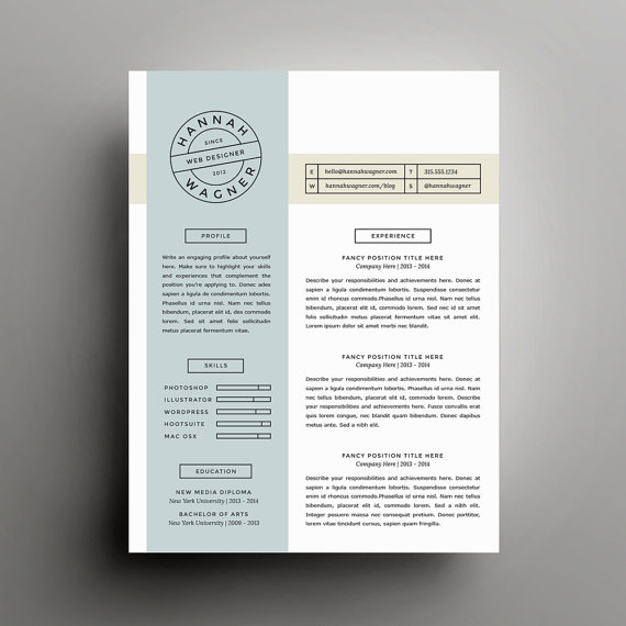
- Mix up the way you visually separate information. While bold, capitalized headers are the standard, thin (or dotted lines) or individual text boxes can help lend a streamlined, design-like feel to your content.
- Don’t feel limited to Serif fonts. An overly cutesy font could send the wrong message about your credibility. There are many Sans Serif fonts - Verdana, Helvetica, and Trade Gothic, to name a few—that are professional while appearing contemporary.
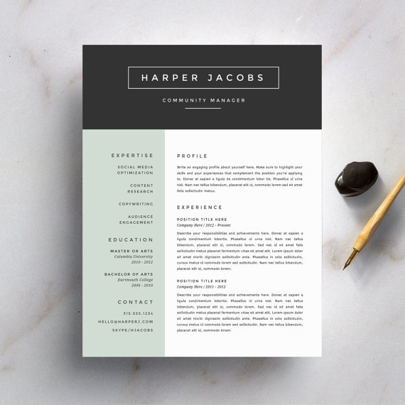
- Introduce color. It’s best to avoid putting a resume on pink paper or using a rainbow of fonts, but a simply-introduced accent color (think blues, reds, and grays) on certain text elements (dividers, bullets, headers) can really break up the monotony.

2. Your Resume Should Be One Page Only
You’ve definitely heard this one before—if you can’t fit your resume onto a single page, you’re being verbose or “exaggerating” your accomplishments.
We're "guilty" of giving the one-page advice. Here's the thing. We do think it's better to keep it brief, but only stick to one page if it makes sense.
This is one resume rule that’s been discredited by many.
This study by ResumeGo found that
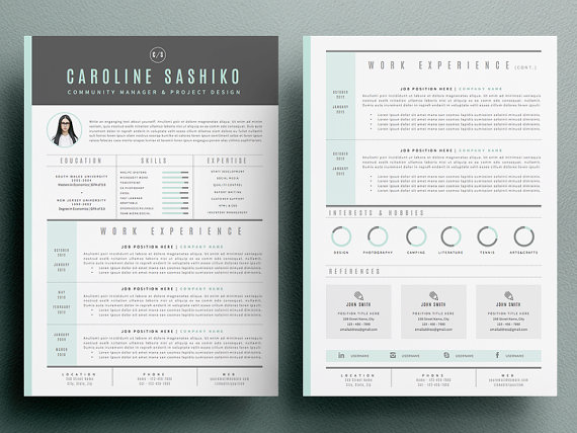
recruiters are 2.3 times more likely to prefer a two-page resume. As people have learned how to scroll on computers and phones, the focus has shifted from having “less content” and more towards correctly organizing that information for the modern gaze. In other words, the most important and relevant information is what stands out first.
Many resume experts now say it’s worse to cram lots of content on one page, and please don't use size 7 font to try to do so.
This results in visual clutter and nowhere for the eye to focus. It is better to prioritize putting the most important takeaways from the experience, key skills, and accomplishments on the first page, then leveraging the second page for additional skills/education, publications, and professional references.
If you are new to your career or want to
hyper-focus your resume for a particular role, one page may be suitable and remember that your
LinkedIn profile can be where you showcase all of your experience—just be sure to include a link to that on your resume under contact. Otherwise, it’s fine to expand to two pages (but no more than that) with clarity and visual hierarchy as your main priorities.
3. Use Microsoft Word
This is an old rule that's ready to be broken.
Microsoft Word is a
great tool for resumes, and there are a lot of great hacks for using its
built-in design capabilities and templates more effectively. Plus, creating your resume with Microsoft Word is necessary to make it through an
ATS—those online systems that "read" your resume because they can't "read" the individual words on a PDF.
If you are proficient in a more design-oriented tool, like Adobe Illustrator or Pagemaker, there is no reason you can’t use those systems to create polished, differentiated resumes that you save as a PDF and use when sharing it directly with someone (like email). Even Keynote can give you the enhanced control over layout elements needed to develop a more stylized output.
4. Avoid Use of Imagery 
Career resources advise against the use of imagery on resumes because they have seen overly enthusiastic candidates add stock photos or pictures of themselves, which is typically not recommended in the majority of cases.
However, using a more subtle approach, you can use imagery or image-like objects to really make your resume pop and break up large blocks of text.
Use your best judgment regarding images because, again, all industries are different. A creative company might love it. A 100+-year-old bank might feel like you've missed the mark. Here are some ideas for how to use images:
- If you have worked at—or for—large, recognizable brands, use their logos instead of company names.
- How about using quality icons? Consider iconography to represent key skills or expertise areas.
- If you are in advertising, marketing or a design-related field, include thumbnails of key items in your portfolio, such as a website you helped build or an ad you wrote.
- Ready to go all the way with it? Infographic-style resumes are pretty trendy, but a warning, they do require a certain proficiency with design and layout!
Resume photos: 1. A simple accent color can really break up the monotony via RefineryResumeCo. | 2. The two-page resume via Odd Bits | 3. A resume that visually separates information and subtly integrates icons and infographic elements via SuitedBrandLab
