Have you ever noticed that some documents immediately appear formal and professional while others look like college homework assignments?
Aside from the level of writing, there is one thing that can instantly make your documents appear polished and professional; a letterhead.
What is a Letterhead?
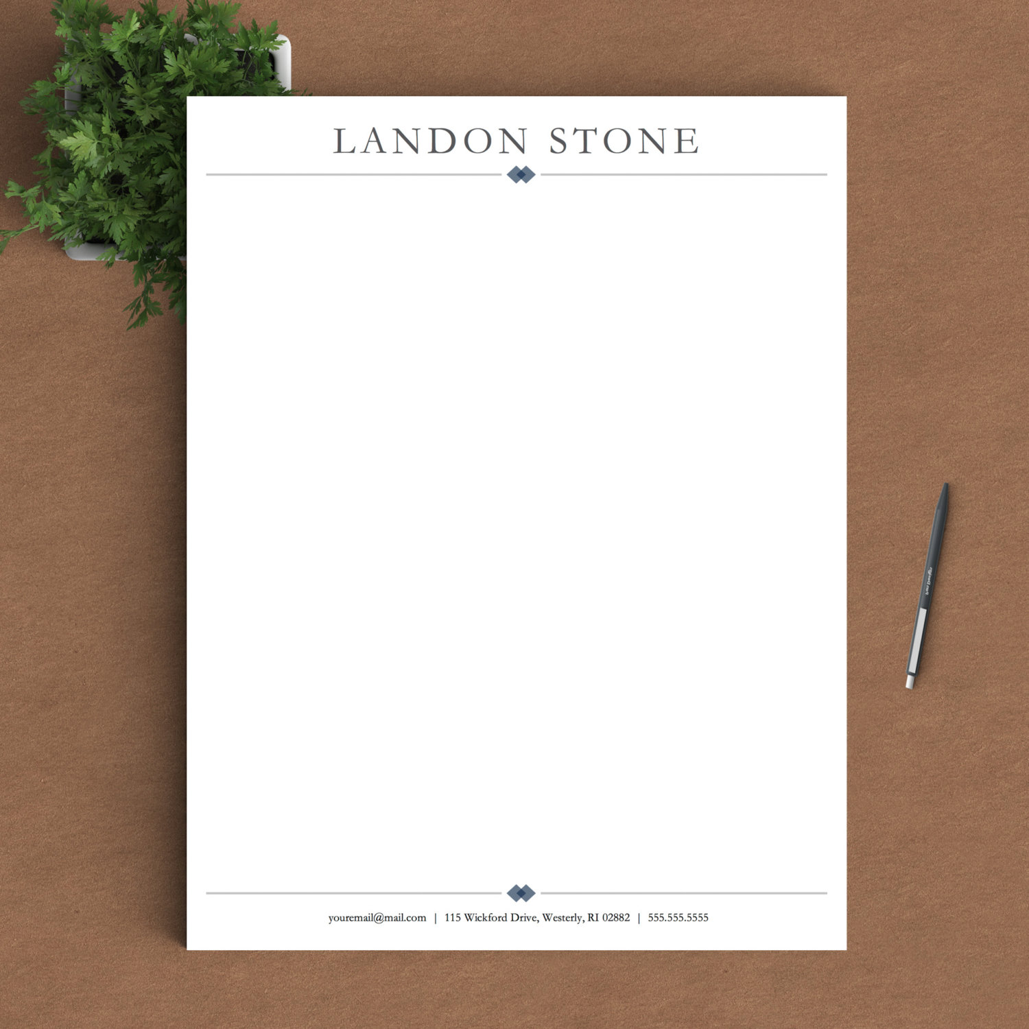 Simple, classic, not too complicated. Still makes your cover letters pop. (Source)
A letterhead is a printed heading stating a person's or organization's name, contact information, and address. You’ll often find that companies use a company letterhead to formalize documents, however using a personal letterhead has the same effect.
Why is Creating a Letterhead Important?
Today, a lot is done over email, however when you are sending a formal letter or memo, it’s nice to send a formatted PDF as well. A great way to do this is to send an email saying “Hi x, Please find a formatted letter attached to this email, and let me know if you have any questions.” By attaching the formatted letter, the reader now has a formal document on file instead of just keeping email records.
By customizing a letterhead, you are automatically giving your documents an air of importance and formality. It also creates a signature look for your documents and makes them easily identifiable. Have you ever dropped a stack of papers, only to realize that they are hard to identify after they’ve been scattered on the floor? By utilizing a signature letterhead, your documents will become easily recognizable, making them less prone to blend in amongst other documents—and more likely to be read.
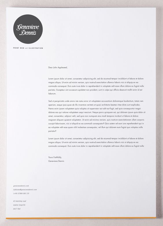 We love the idea of this bold graphic in grayscale. (Source)
When Should You Use a Letterhead?
Letterheads should be used whenever sending a formal document. Examples of this include:
- Resumes/cover letters
- Prospect letters
- Letters of resignation
- Letters of recommendation
- Business proposals
- Application essays (if there’s no online form to fill out)
- Business memos
How To Create One
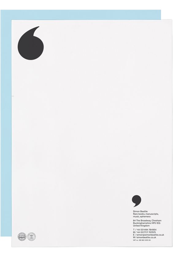 Cute quote marks. A bit daring, but if you're a creative, going bold isn't a bad idea. (Source)
Looking at examples will give you a better idea of what various letterheads look like and how to accomplish the design you’re after. We've gathered some examples in this article, but you can also try
searching for "cover letter design" on Pinterest for inspiration. Not feeling particularly creative? You can buy letterhead templates made for Word from Etsy.
What Should Be Included
- Name
- Phone number
- Email address
- Address (or “City, State” if you don’t want to include your address)
It’s always good to at least indicate your city and state on a letterhead because it gives the reader a better sense of where you are, triggering an immediate connection with you. If you are applying for a job, hiring managers often want to see where you live to get a better sense of where you’re going to be commuting from. Including a city and state can also be a great conversation starter. For instance, “I see you live in San Francisco. What part of the city do you live in? I grew up there!”
Tips
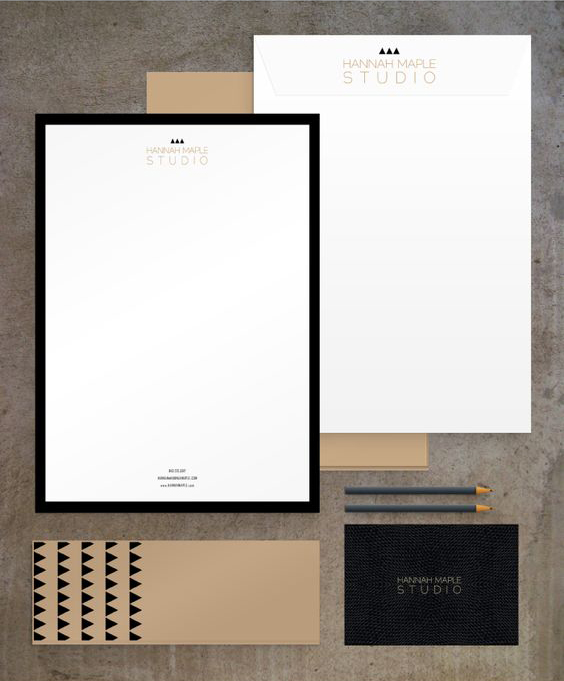 Go big or go home. Why not brand all your paper goods while you're at it? (Source)
- Stick with traditional fonts such as Garamond, Arial, Bodoni, and Gotham, but here's a great list of some unique fonts along with their reputation.
- Stay away from using colors. Black is always the best bet, but if you really want something in a different hue than the body of your document, stick with a gray. You want the letterhead to be easy to read, to-the-point, and professional; no need for frills.
- Be consistent. Make sure you utilize the same spacing and way of writing throughout the letterhead (i.e. either write out each number or consistently use numerals; don’t switch between the two formats)
- Check for errors. If there are typos or misprints in your letterhead, this will immediately indicate that you lack attention to detail and are careless. Typos within your contact information could also result in the reader’s inability to contact you.
 Simple, classic, not too complicated. Still makes your cover letters pop. (Source)
 We love the idea of this bold graphic in grayscale. (Source)
 Cute quote marks. A bit daring, but if you're a creative, going bold isn't a bad idea. (Source)
 Go big or go home. Why not brand all your paper goods while you're at it? (Source)


